
Configure charts and metrics

Charts explain a breakdown or trend. Metrics show one summary value. Use both when a dashboard needs an at-a-glance result and the context behind it.
Who this is for
Section titled “Who this is for”Agency team members who build reporting dashboards or operational summaries. Requires View Layouts and Edit Layouts.
Before you begin
Section titled “Before you begin”- Create a view and add a section. See Create a view.
- Decide whether the result needs a category breakdown, a trend, or one summary value.
- Identify the data source, calculation, grouping field, and filters that define the result.
Configure a chart
Section titled “Configure a chart”- Open the view in the builder from Settings, then Views ( /settings/views (opens in new tab) ).
- Drag a chart from Data into a section. Available chart blocks are Bar, Line, Pie, Donut, Area, and Scatter Plot.
- Select the chart and expand General.
- Enter Chart Title, confirm Chart Type, and choose Data Source.
- Expand Data.
- Under Data Series, select Add Series when the chart needs another calculation or subset.
- Choose Group By (Categories) for the category axis.
- Configure Sort Order, Data Limit, filters, and optional date filtering.
- Under Style, configure chart height, palette, legend, labels, stacking, axes, and number formatting as needed.
- Select Save Draft.
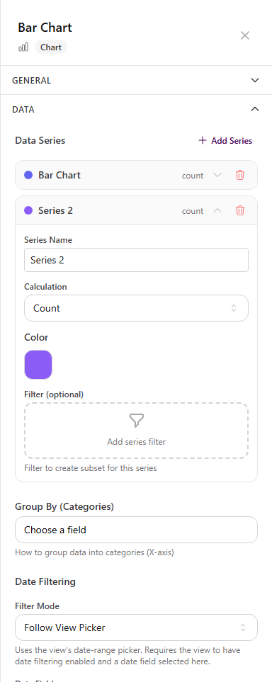
For a count by status, use a count series and group by the status field. For a trend, use a line or area chart with an appropriate date grouping.
Configure a metric
Section titled “Configure a metric”- Drag a metric from Data into a section. Available metric blocks are Count, Sum, Average, Percentage, and Custom Metric.
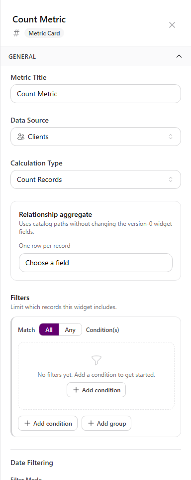
- Select the metric and expand General.
- Enter Metric Title.
- Choose Data Source.
- Choose Calculation Type and any field required by that calculation.
- Add filters to define which records contribute to the value.
- Configure Date Filtering when the metric should follow the view picker.
- Turn on Apply additional calculation only when the base result needs a static adjustment or second metric.
- Select Save Draft.
Arrange a dashboard
Section titled “Arrange a dashboard”A useful operational dashboard often follows this order:
- Metrics for the most important totals or rates.
- One or two charts that explain the breakdown.
- A filtered table or Kanban board for the underlying records.
Keep each block focused. A metric named Overdue tasks should filter to overdue tasks; a chart named Tasks by stage should group tasks by the stage field.
Expected result
Section titled “Expected result”- Charts render the selected calculation grouped and sorted as configured.
- Metrics show one value calculated from the matching records.
- Dashboard blocks that follow the view picker update for its selected date range.
Troubleshooting
Section titled “Troubleshooting”| Symptom | Likely cause | What to do |
|---|---|---|
| Chart has no categories | Group By (Categories) is empty | Choose a grouping field |
| Chart or metric is empty | Data source, filters, or required calculation field is incomplete | Review General and Data from top to bottom |
| Metric is unexpectedly high | Filters are too broad | Add conditions that match the metric title |
| Dashboard date picker changes some blocks only | Other blocks do not follow the picker or lack a date field | Configure Date Filtering on each intended block |
| Labels are hard to read | Chart style does not fit the data | Adjust height, label rotation, legend, data limit, or chart type |
Related articles
 Concept Views and dashboards overview Understand how AgencyTitan views combine tables, Kanban boards, calendars, charts, and metrics into scoped dashboards and work surfaces.
  How-to Create a view Choose a global, client, or process scope, create the view, and add table, Kanban, calendar, chart, or metric blocks in the builder.
  How-to Filter and sort view data Configure per-widget filters, condition groups, sorting, limits, and view-level date filtering in a dashboard.
  How-to Configure Kanban and calendar views Configure Kanban grouping, cards, behavior, filters, and calendar data sources, date fields, and default display.